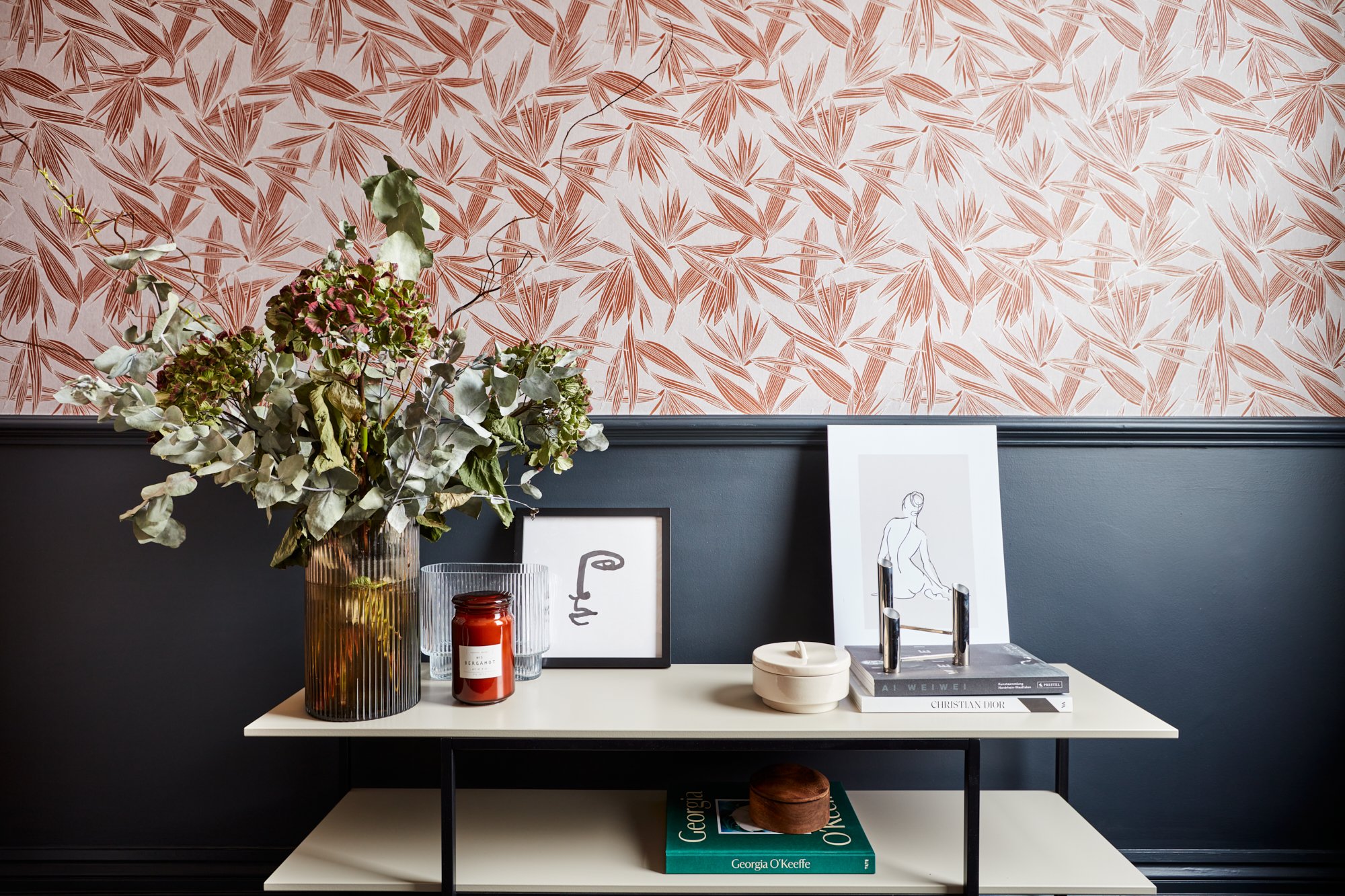
living the victorian dream
With the advent of spring, we welcome you to our Journal, a monthly newsletter written to exchange news and views about the importance of interior design in our everyday lives. I hope you will enjoy the read and we look forward to receiving your feedback.
London’s Housing Stock
It might come as no surprise to learn that the majority of London’s available housing stock dates back to the Victorian era where the then Queen oversaw something of a building boom during her reign. Built to house urban workers streaming to the capital during the Industrial Revolution, in many ways, we are still, extraordinarily, benefitting from that Victorian dream.
With some buildings originally incorporating staff quarters, others enjoying big bay windows allowing the sun to shine through and still more enjoying that miracle of Victorian ventilation, a sash window, the majority are placed in opposing rows of long terraces with similar layouts - living and dining rooms at the front, utility and a garden at the back, a narrow hallway and bedrooms above.
Extending with Style
We all enjoy sturdily built Victorian architecture for their soul and character as well as their physical attributes such as high ceilings, large windows and their attractive decoration – elaborate cornicing, fireplaces, ceiling roses – but how do you bring it into the twenty-first century, enjoying the heritage but making it fit for purpose with contemporary family living?
Well, let’s deal with the layout first of all. The space we generally have to work with is limited to the rear of the property – taking some of the garden to expand out to encompass an open plan, light filled space offering a casual dining area, a modern kitchen and often comfortable seating perhaps with a TV.
“Never be afraid to alter a layout of a Victorian property – there is always an architectural solution.”
Light is paramount here through custom bifold doors, French windows or glass roofs looking out over a landscaped garden lending an overall impression of expansive space. Working with a landscaper, the remaining outside area can incorporate seating, dining areas, BBQs, banks of flowers, lighting – making the space work for how that family will use it. The one thing I have learnt through the years, never be afraid to alter a layout of a property – there is always an architectural solution.
The “Passage Room”
With most of the everyday living taking place either at the front of the house in the living room or to the rear with the kitchen extension, what do you do with that redundant middle room which is often lying unused - a “passage room” as I like to call it. We no longer need or use formal dining rooms but this second living space is a gift for a modern family.
“I see the home as a sanctuary. It nurtures your body, whilst the garden nurtures your soul.”
I like to suggest that this underestimated room be brought back to formal usage becoming an intellectual area – a library, home office or a music room – somewhere the family will use and enjoy frequently for their pursuits. It can also be closed off with pocket doors when required with a large library table installed so you can read with the kids or offer a quiet area where they can do their homework.
Uncluttered Hallways
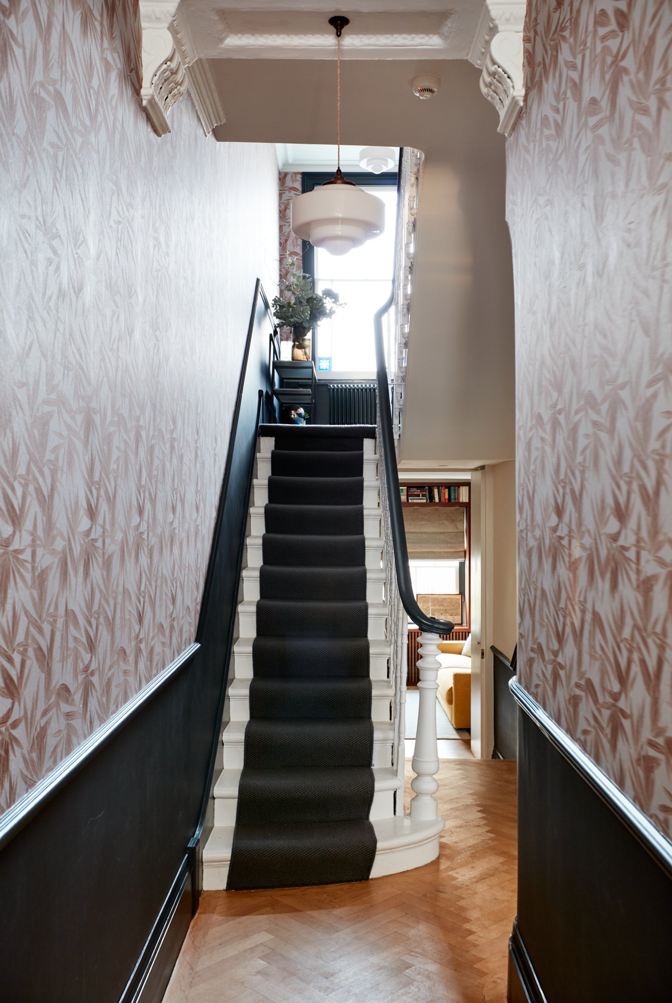
One of the few downsides to a Victorian terrace is the lack of space as you enter the property. You generally have a small foyer with stairs up to the first floor so there is little space for outdoor clothing when entering. This is where that “passage room” can come in handy once again. I like to leave the entrance way as it is with its clean lines and historic elements retained whilst installing a bank of seamless and hidden handcrafted cupboards and shelves for a wall of storage where coats, shoes and the detritus of everyday life can be hidden away.
Bridging the Eras
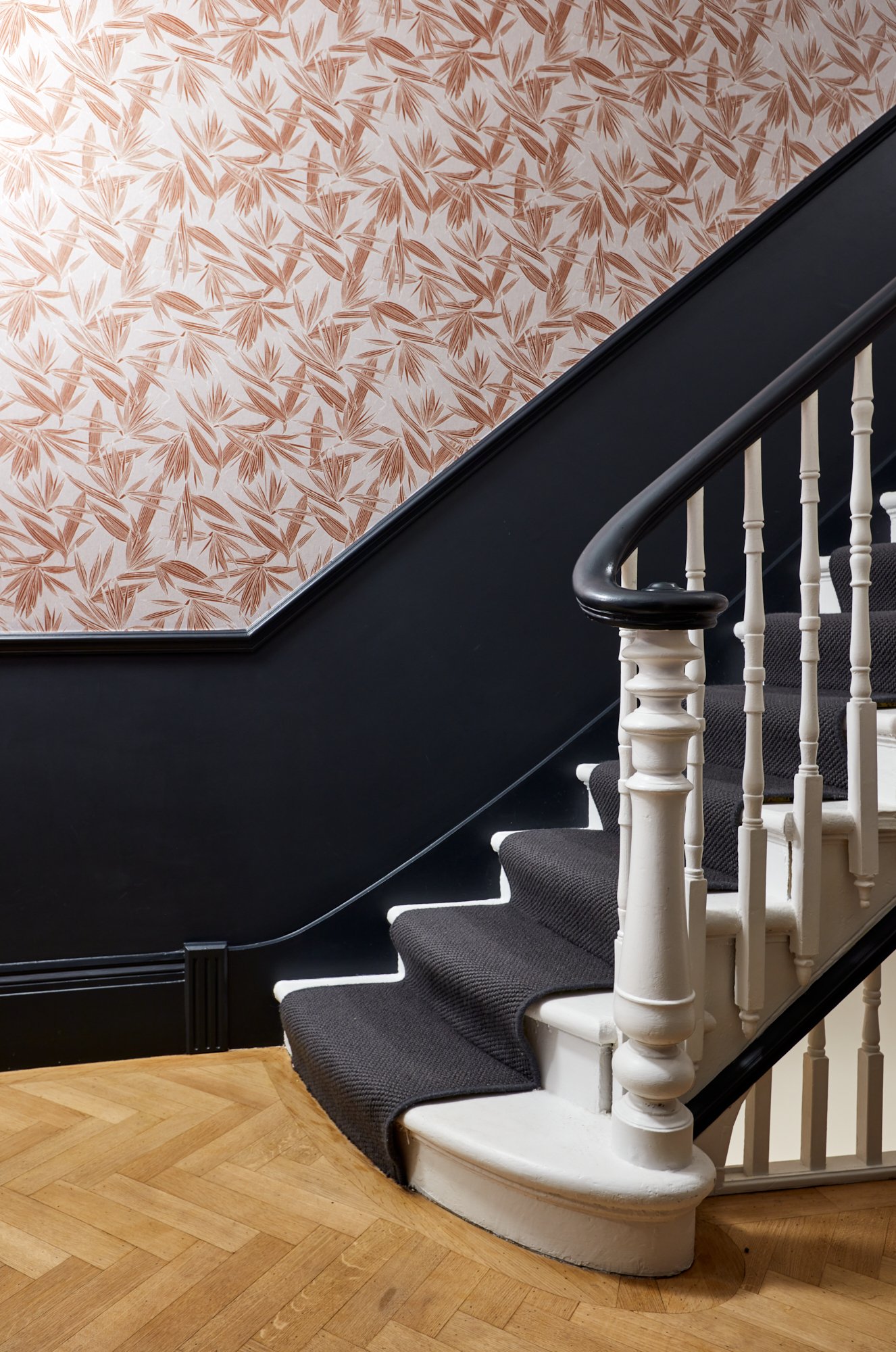
We all buy our Victorian homes to enjoy their original decoration and to a large degree, I like to keep and restore key elements such as ceiling roses, cornicing and the occasional fireplace. In most Victorian homes there are fireplaces in every room as they were needed for heating but today, we don’t need them all so let’s keep the living room example as a design focus and hide the others behind walls of storage. Whilst structural solutions are always possible, often it is simply easier to make them disappear.
"There is a fine line between restoration and renovation”.
In some homes, the doors are also shortened with a stained-glass window above it. I tend to replace these with tall, sleek custom doors to lend modern elegance to a room and to complement the ceiling heights. I also like to install cast iron radiators throughout. The lighting design needs to set the design alive and highlight historical detailing. With colours, I look at a room as a conductor looks at an orchestra, building up a palette to bring in colour to give an overall soothing, subtle mix of both warmth and coolness.
Custom Touches
When a renovated home demands a certain light fitting or piece of furniture and we cannot find an existing example, we will design what we need and have it custom made by one of our incredible craftsmen. We use specialist joiners and upholsterers for all our fitted furniture, doors, headboards, etc in our designs but often we go that one step further and design armchairs, dining chairs – whatever is required – and will have them made in-house. We also look at a client’s existing furniture and may upcycle a piece – perhaps lacquering a table or reupholstering a sofa. In this way, a prized heirloom can be given a new lease of life, it is better for the environment – less waste – and it can fit a scheme to perfection. To a large degree, working closely with a client, I know where every piece of their furniture and new items will be placed before we even start work. It is important to achieve a sense of harmony and serenity to ensure your home becomes your sanctuary.
To Chandelier or not to Chandelier
A ceiling rose needs a statement pendant. Victorian homes generally had just the one central pendant for a light fitting which is insufficient lighting. That is why I tend to use a mix of architectural lighting, including uplighters or downlighters, and decorative light fittings to enhance a space. There is nothing, however, like a beautiful pendant to make a statement, bring a breath of personality and to bring that finishing touch. These can range from Scandi wood constructions for minimalist spaces to alabaster and bronze vintage fittings by designers such as Pierre Chareau. It can even be a Venetian Murano design but the most important thing to remember is, it needs a good drop of between 60 to 80 centimetres to see the full beauty of a lighting fixture.
When Privacy is Required
Victorian terraces often have very little space between the bay window and the pavement outside making privacy something of an issue. Rather than use the ubiquitous plantation shutter as a solution, I tend to install a bespoke “cafe curtain” using a soft, sheer fabric to keep prying eyes from seeing in, framed by floor to ceiling double pleat curtains often on a French return pole, long enough to sit and break a little on the floor. This works well during the day but obviously at night, the sheer fabric offers little protection and this is when you close your long curtains. Alternatively, I bring back original Victorian shutters (not plantation shutters), split to allow light to enter through the upper part of the window, perhaps softening them by hanging dummy curtains either side for show.
About Studio Sidika
Studio Sidika is a full-service interior architecture and design studio led by Sidika Owen d’Hauteville and established in 2015. Sidika has a mixed background being half Turkish and half British, was born in Brazil and brought up in Provence. This diverse heritage has served her well, opening her eyes up to different cultures, architecture, textiles and furnishings from an early age and giving her unique insights into contemporary design. Originally working as an investment banker in the luxury goods sector, her corporate background underpins a rigorous approach when it comes to budgeting, financial planning and project co-ordination. Passionate about sourcing contemporary art and antiques from various artists, galleries and countries, she is driven by an appreciation for the beauty in everyday life. Her studio designs timeless and inspiring spaces that make living easy.
Contact Us
Our clients are discerning homeowners and residential developers who value the blend of beauty, function and comfort.
To discuss your project with us, however small, book a consultation at www.studiosidika.com or email us hello@studiosidika.com


